
 Members Area Tutorial: Create A Mixed Media Piece From A Hand Drawn Illustration In Photoshop
 Members Area Tutorial: Photo Manipulate a Complex Falling Angel Scene
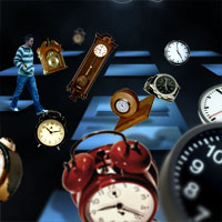 Create an Elaborate Photo Manipulation Around the Theme of Time
Have every post delivered to your inbox and get access to hundreds of useful design freebies.
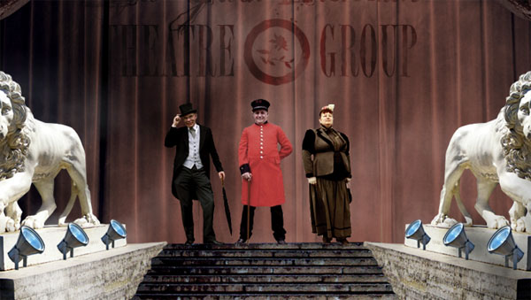
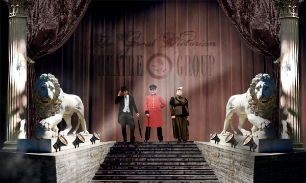
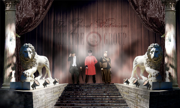
As always, this is the final image that we’ll be creating:

The following images were used in the making of this tutorial:
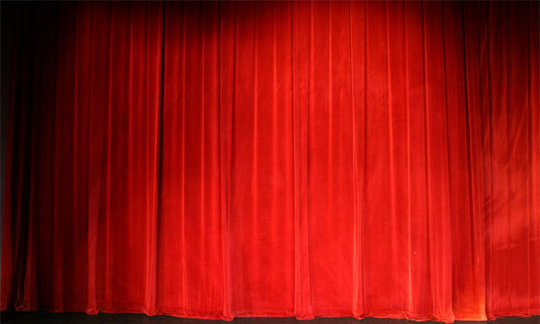
Lion Statue
Steps
Curtain
Victorian Woman
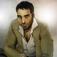
Victorian Man
Victorian Gentleman
Light
Pillar
Hanging Curtain
Old Paper Texture
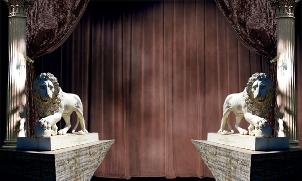
Create a new document (1000X600px). Then paste in your photo of a theatre curtain.
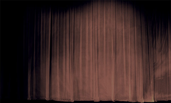
Now we want to make the curtain more intense, yet also more retro feeling.
STEP A:
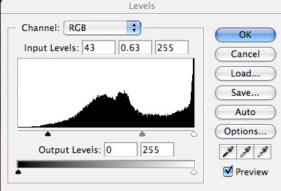
First I go to levels and apply the settings shown below. By moving the left and middle sliders to the right, the shadows of the curtain are emphasized, which gives it overall more intensity.

STEP B:
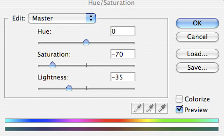
Now I go to image>adjustments>hue/saturation and reduce the saturation and lightness. This is to try and achieve a more retro feel, through the use of washed out colored, creating a dusty, worn look.

STEP C:
Now to really create an old, dusty looking curtain, I go to image>adjustments>color balance and apply the settings shown below:

RESULT:
Now create a new layer called ‘clouds’. Go to filter>render>clouds. This will render clouds over your entire canvas. However, we want the clouds to only be in the center of the stage, and to gradually fade out towards the edges of the piece.
To achieve this, we require a layer mask. Go to layer>add layer mask>reveal all. Now select your gradient tool, and choose a white (0% opacity) to black (100% opacity) radial gradient. Drag this gradient out from roughly the center of your canvas towards one of the edges. This will create a ball of cloud in the center of your canvas.
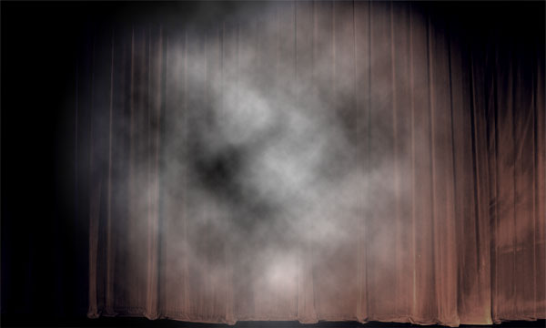
Finally, to make the clouds blend better with your curtain, change your ‘clouds’ layers blend mode to ‘soft light’.

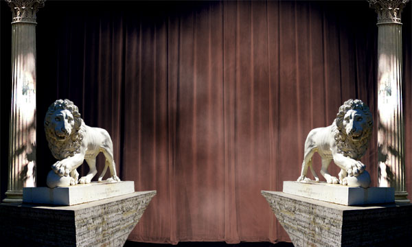
Now cut out and paste in an image of a lion statue. I cut out this image using the lasso tool, but the pen tool works equally well. Position the lion statue in the bottom left area of your canvas, and then duplicate this layer, go to edit>transform>flip horizontal and position the flipped statue in the bottom right area of your canvas.

Now merge down the top lion layer, so that both of your lions are on one merged layer.
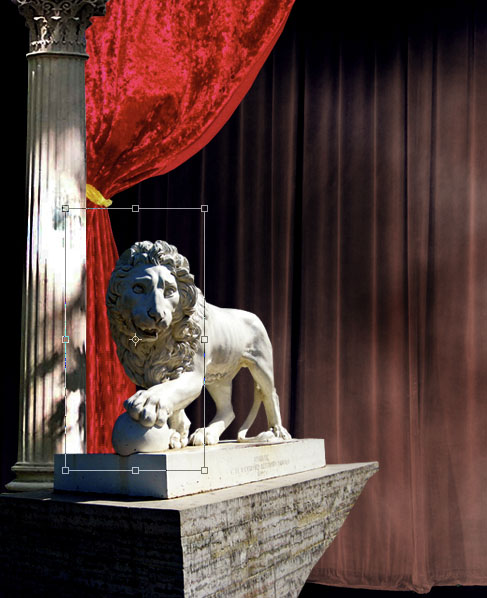
I want to make the lions more intense. The colors and saturation appear OK, so I just go to image>adjustments>levels and alter the levels slightly, to add more shadow to the statues.

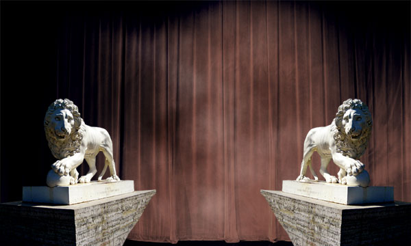
Now paste in a pillar behind your left lion layer. Duplicate it, and move the duplicate to behind the right lion.
Just like with your lion layers, merge your two pillar layers together.
Then apply the levels setting shown below to make your pillars more intense.
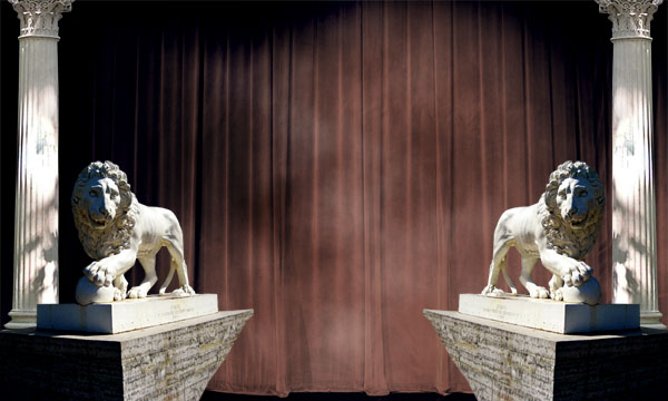
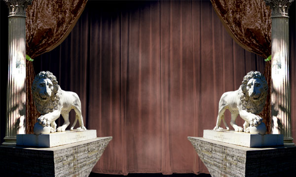
Now I paste in an image of a tied back theatre curtain. I position it on a new layer, beneath my pillar and lion layers. You can see from the first image below that the photo does not extend far enough downwards to cover the area between the lion and pillar. To fix this, I use my rectangular marquee tool to select the area of curtain below the gold tie, and then go to edit>transform>scale and simply drag the bounding box downwards.
Finally, I go to filter>sharpen>sharpen (with my bottom area of curtain still selected). This is because transforming this area of curtain led to it becoming slightly blurred, and I wanted it looking as sharp as the upper area of curtain.

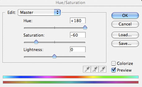
Now merge your two tied curtains layers together. We want to blend these curtains with the rest of the piece, specifically the main backdrop curtain.
STEP A:
Start by going to image>adjustments>hue/saturation:
STEP B:
Then go to image>adjustments>levels and apply the settings shown below:

STEP C:
Go to image>adjustments>color balance and apply the following settings:

STEP D:
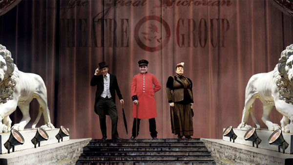
You should end up with a final result like this:
If you look at our image so far, the tied back curtains are certainly an improvement on before, but sometimes initial blending just doesn’t cut it. To improve them further, I go back to hue/saturation settings and adjust them again:

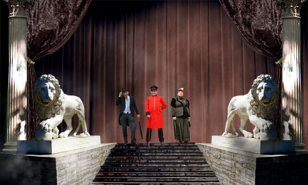
Now paste in an image of some steps behind your lions layer.
Then go to image>adjustments>levels and apply the settings shown below:


Looking at the join between the lion statue’s bases and the steps, it’s a little too uniform. To make it more jagged and thus realistic, I select the lions layer, and use the lasso tool to select/delete a jagged edge.

Create a new layer called ‘cloud front’. Go to filter>render>clouds. Then, just as you did with the clouds in front of your main curtain, apply a layer mask, and then fade out the edges of the clouds using a white-black radial gradient. Make a ball of cloud in front of the left lion statue. Create a new layer called ‘cloud front 2′ and repeat these steps, creating the clouds in front of the right statue.
Then change both layers blend modes to ‘hard light’. This should create a subtle, but visible mass of clouds in front of each statue.

Now paste in three photos of Victorian characters. I cut them out using the lasso tool, but again, the pen tool is equally suitable.
Position the characters at the top of the stairs.
Now apply some text to the center of your back curtain. I used the font ‘Dirty and Classic’ and the color B2826C. Then I changed my layer blend mode to ‘color burn’ and reduced the opacity to 60%.
I want to make the text less flat, and more fitting to the wavy shape of the curtain. To do this, I go to filter>distort>ripple and apply a ripple effect (amount: 60%).

Now add some more text and a symbol to your curtain. Make sure to make them all the same color, and then change each layer blend mode to ‘color burn’ and apply the same ripple filter.

Now use a rough eraser brush to erase parts of your text, creating a more grungy appearance.
Now paste in a photo of a light. Position it on the edge of the left lion statue. Then duplicate it, and move the duplicate down the edge of the statue. Go to edit>transform>scale and shrink the duplicate light very slightly. Repeat this to create a third, smaller light. This should give the illusion of perspective, as a line of lights line the statue, each appearing smaller as it gets further away from us.
Finally, merge these three layers, and duplicate the merged layer. Then go to edit>transform>flip horizontal and move the flipped row of lights to the opposite statue. Then merge this layer with the left row of lights layer.
Now select your merged lights layer, and apply the levels and hue/saturation settings shown below:

Now create a new layer called ‘light beams’. Create a selection using your lasso tool, that spans out from the far left light, in the rough shape of where light would be pointing. Be sure to expand your ‘light beams’ area as you get further away from the light source.
Then, with your selection in place, go to filter>render clouds.
Then go to filter>blur>gaussian blur, and apply a blur of 9.5 strength.
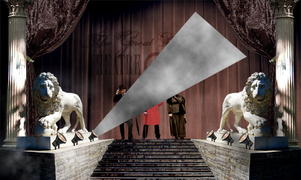

Now change your ‘light beams’ layer’s blend mode to ‘linear dodge’ and reduce it’s opacity to 40%. Then use a large, soft eraser brush to eraser the very end of the light beam, so that it gently fades into the background curtain.
Now duplicate your light beam and place it over each one of your lights (including the lights on the opposite side, by flipping it).
You may notice that where all of the light beams connect is overly bright, detracting from the rest of the image. To fix this, I simply erase this area using a large, soft, low opacity eraser brush.
Clearly with so much lighting pointing towards our actors, they would cast a shadow on the back curtain. Fortunately we are going to construct one!
To do so, ensure that all 3 of your actors have been merged to be on the same layer. Then duplicate this layer, and move the duplicate beneath the original. Then go to blending options and apply a black color overlay.
Then go to edit>transform>distort and distort your shadow layer so that the shadows follow the path of your light beams.
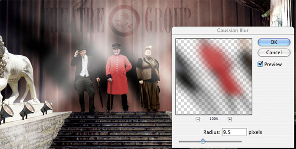
Finally, go to filter>blur>gaussian blur and apply a 9.5 strength gaussian blur to your shadow layer.

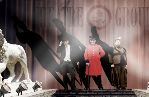
Now reduce your shadow layer’s opacity to 60%. Then duplicate it, flip it horizontal, and move the duplicate to fit the path of your other set of light beams.
Now create a new top layer called ‘shadows’. Select a medium sized, soft black paintbrush (5% opacity), and set it to ‘color burn’ mode.
Then proceed to brush over areas that you feel require more shadow. This step is very important in shaping your overall image. I can’t provide too many specific instructions, but simply pay attention to your light sources, and overall composition. In this piece most of the light is in the center of the piece, so try to add more shadows to the edges of the canvas. Similarly, shadows can further the depth of the piece, so try to add more intense shadows in the back drop.
You can see my brush strokes in the image below, as well as the result:


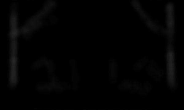
Now, you guessed it, create a new top layer called ‘highlights’. Repeat the same steps as Step 24, but this time use a white paintbrush, and set your blend mode to ‘normal’. Also reduce your brush opacity to around 2-3%.
I’ve indicated my brush strokes by showing them against a black background. As you can see, they’re very subtle, and focus mainly on the pillar areas, making them stand out more in the foreground, and helping to round them more.

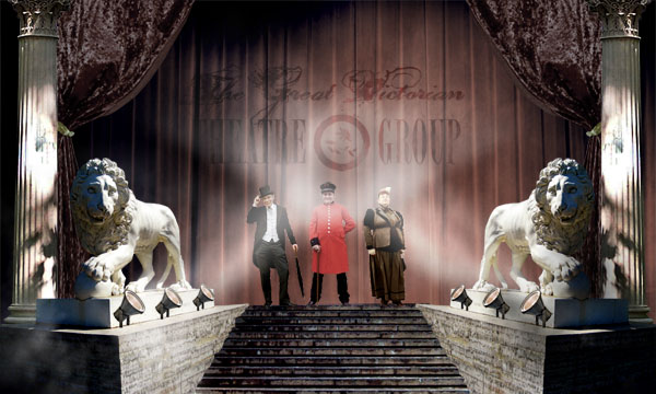
Now paste in an old paper texture that covers your entire canvas. Change the layer’s blend mode to ‘multiply’ and reduce it’s opacity to 50%. This should give your piece an even older feel, and tie it all together nicely.

I really hope that you enjoyed this tutorial and would love to hear your feedback!
If you want to view the full sized final image, then click here:

Tom is the founder of PSDFAN. He loves writing tutorials, learning more about design and interacting with the community. On a more interesting note he can also play guitar hero drunk with his teeth.


Do you know the basic tools in Photoshop but feel that your work is still looking average? Join our creative community at FanExtra and get the direction you need to take your work to the next level.


this is good for beginners……….
Good tutorial with an interesting outcome. I would prefer it if the light coming out of the spotlights was a bit sharper because it gives the appearance of fog rather than light.
I like it though, thanks.
Excellent Job! Thanks for the inspiration! This is going to be a great technique for my next project!
Thanks a lot for your comments guys!
Adam: Good point about the lighting. I would suggest less of a gaussian blur, and a higher opacity to achieve a less fog-like appearance.
Eric: I’m glad it helped inspire you! Please feel free to post your project here when it’s complete.
dude cool tut is this yours ? how do you publish other peoples tuts – or dont you b
Hi B. Yes this is a tutorial that I wrote myself, although occasionally at PSDFAN I’ll publish tutorials written by some of my readers.
Hi, I managed to follow every step you gave only up to step 8, could you explain how you managed to pin the curtain underneath the pillar and the lion statue?…Everytime I paste the curtain, it hides the pillar and the lion when I place it where it should be…