 Photo Manipulate a Stunning Underworld Scene
 How to Create a Lighter Illustration from Scratch in Photoshop
 Creating the Eerie Photo-Manipulation ‘Captive’
Have every post delivered to your inbox and get access to hundreds of useful design freebies.
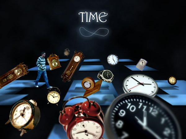
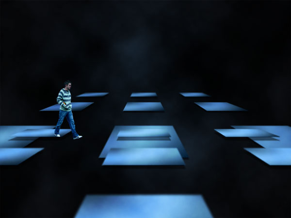
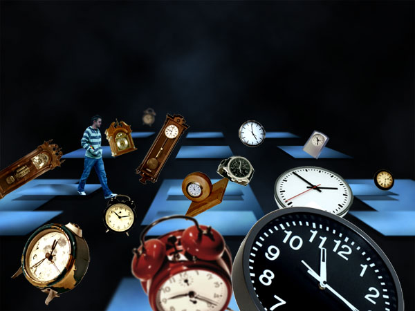
This is the final image that we’ll be creating:
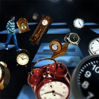
Here is a list of images used in the making of this tutorial:
Start by opening up a new document (800X600px) and create a new layer called ‘main background’. Fill your canvas with a radial gradient, ranging from 142331 to 0C0D11.

Create a new layer called ‘clouds’. Go to filter>render>clouds to render some clouds over your gradient background. Then change your layer’s blend mode to ‘multiply’.

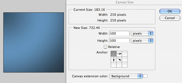
Now create a new document (250X250px), and then create a new layer called ‘gradient square’. Fill your canvas with a gradient ranging from medium blue, to light blue, to medium blue. Then go to image>canvas size and expand your canvas 250px to the right and 250px downwards.

Now hide your original white background, leaving only your ‘gradient square’ layer. Go to edit>define pattern and save your square+transparent background area as ‘bluesquarepattern’.

Now create a new document (1500X1500px) in size. Create a new layer called ‘blue square grid’, and then fill your entire canvas with color (any color you want). Reduce the ‘fill opacity’ of this layer to 0%, keeping the main layer opacity at 100%. Then go to blending options and apply your bluesquarepattern as part of a pattern overlay. This should give you a grid of blue squares.


Now you want to have your grid on a layer without any overlay effects, so that you can manipulate it as a raster object. To do this, simply create a new layer beneath your grid layer in your layers palette, and then merge down your grid layer with this blank layer (option+e).
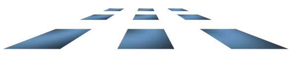
Now go to edit>transform and you will see tools such as ‘perspective’ and ‘distort’. With your grid object selected, use these tools to create the impression of perspective in your grid, making each square look like a flat platform. To do this, I grabbed my perspective tool, and pulled in the sides at the top of my grid. Then, using my distort tool I dragged up the bottom of my grid, making it far less high. You can see the result below:
Now paste this grid into roughly the center of your original document.

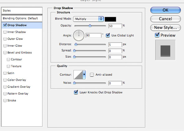
Now apply a subtle drop shadow effect to your grid layer in order to give your grid squares or ‘platforms’ a little more depth.
Now repeat the technique used to get rid of the pattern overlay effect and turn your original grid into an object. Create a blank layer beneath your grid layer and merge it down. This will get rid of your drop shadow as a layer style, and will make it actually part of your grid object.
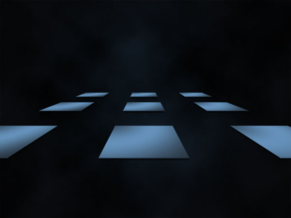
Then duplicate your grid layer and go to edit>transform>scale. You will see a menu appear above your canvas where you can specify the X and Y size dimensions of your object in terms of %. Increase this duplicate grid’s size to 200% on both axis. Then shift it down your canvas. This should give the impression of a second grid being ABOVE your original.
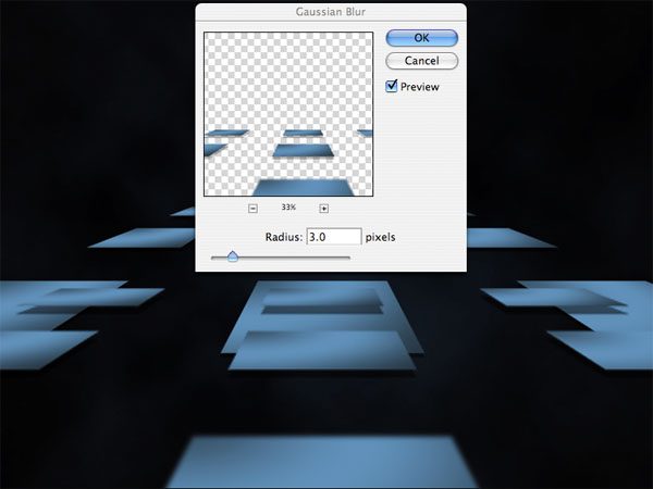
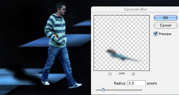
Now select the square platform nearest to you using your marquee selection tool, and go to filter>blur>gaussian blur. Apply a blur of 3px. This should give the impression of the focus on this platform declining due to it being so close to you.
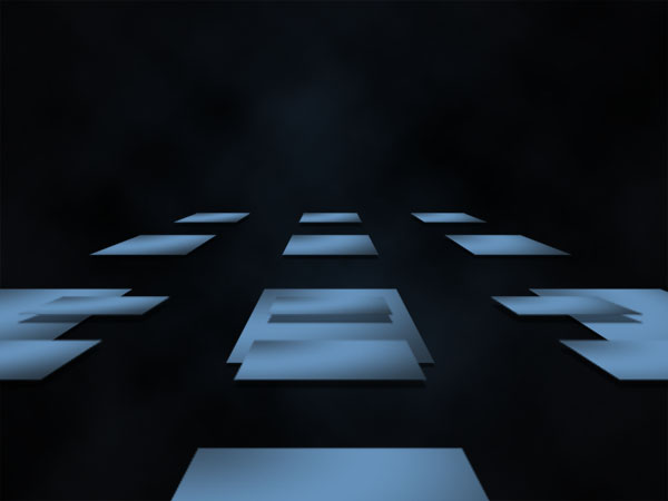
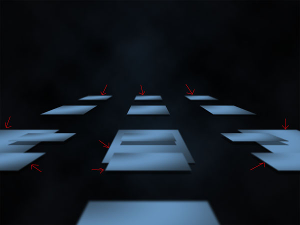
Now apply the same technique to some other grid squares to improve the impression of depth we’re creating. However, this time only apply a 1px gaussian blur, as the platforms are further away from us. Apply this blur to the second nearest platforms, and the very back ones. I’ve indicated the platforms that I blurred below:
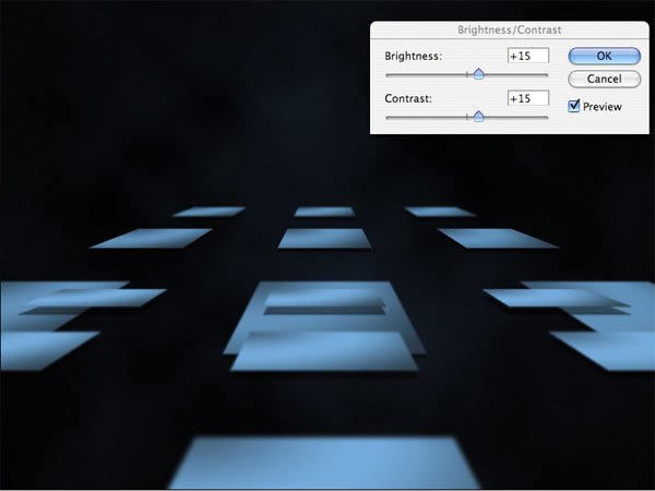
Finally, select your top grid layer and go to image>adjustments>brightness/contrast and increase both your brightness and contrast to +15.
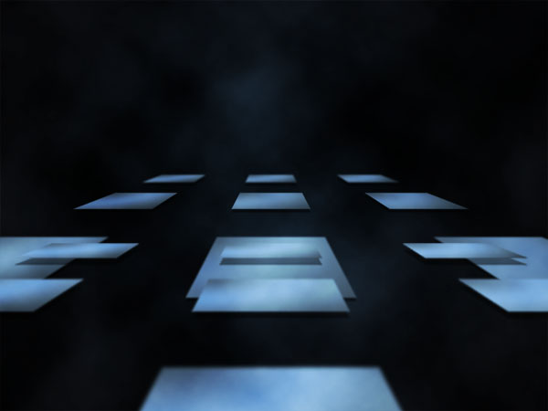
Now duplicate your ‘clouds’ layer and move it to be your top layer (above your grid layers). Change your layer’s blend mode from ‘multiply’ to ‘overlay’ and reduce the layer opacity to 50%.
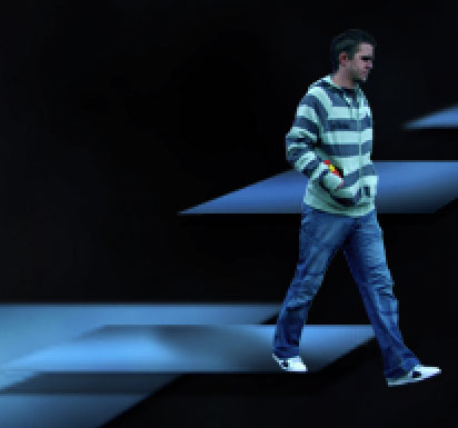
Now paste in a photo of a man walking. Be sure to cut him using the lasso tool or pen tool. Position him so that he looks to be walking off the edge of one of the platforms.
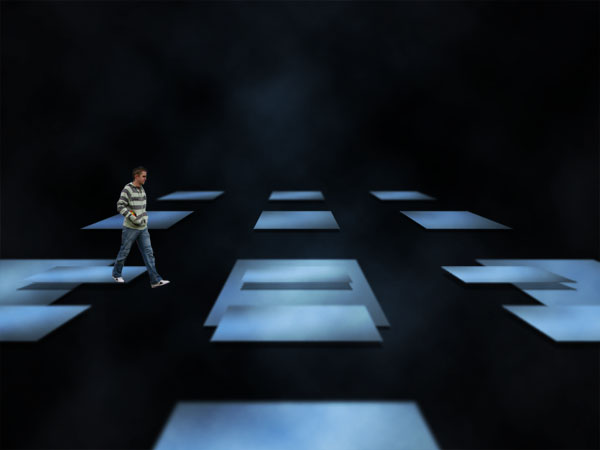
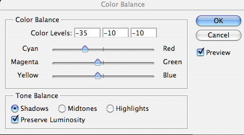
Now go to image>adjustments>color balance and apply the settings shown below to alter the colors of your man photo.


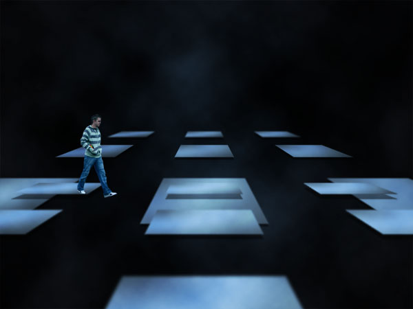
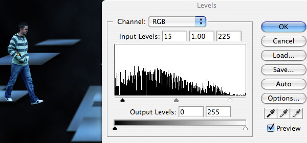
Now go to image>adjustments>levels and make the adjustments shown below to increase the vividness of your man photo image.
Now apply the level settings shown below to both of your grid layers.

Now duplicate your man layer and move the duplicate beneath the original, renaming it to ‘man shadow’. Apply a black color overlay, and then go to edit>transform>distort and distort your black man shape to form a nice looking shadow.
Now option+click on your top grid layer in your layers palette to select all data on this layer. Then go to select>inverse to invert your selection. With your selection in place, select your ‘man shadow’ layer and hit delete. This will delete all parts of your shadow that aren’t over your platform. Then reduce your man shadow layer’s opacity to 50%.


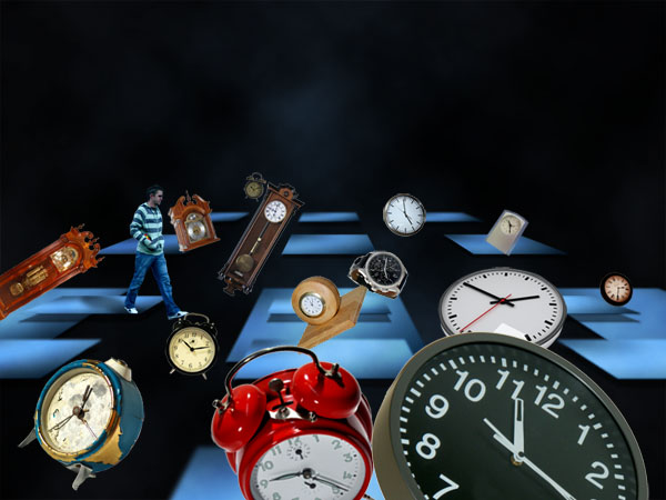
Now to set up your composition. Paste in as many images of clocks as you can find, and position them all of your canvas. I tried to give the impression of the clocks spilling out from the left of the image and coming towards me, so I had larger clocks nearer the bottom of the canvas.
At this stage don’t worry about colors or blending or anything, just try to set up the actual positions of your clocks in relation to your overall image. To make the composition seem a little more random I rotated most of my clocks by going to edit>transform>rotate.
Now I manipulate my clocks to stand out more, and also blend together with the whole image. I can’t go into the exact alterations to each clock because it would take far too long. The important thing to do is to use your own judgement and see what looks good to you.
However, I will provide a rough guide of what I did with each image:
Firstly I went to image>adjustments>hue/saturation and dropped the hue to around -40 and the lightness to around -15.
Then I went to image>adjustments>levels and changed the levels to really bring out the shadows and highlights of each image.
Then finally I went to image>adjustments>color balance and played around with the settings here. For the wooden clocks I reduced the blue in order to bring out the reds of the wood.
Again, these are only rough guides of what to do, just play around with settings yourself until it looks right.

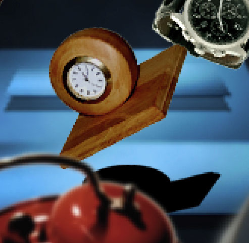
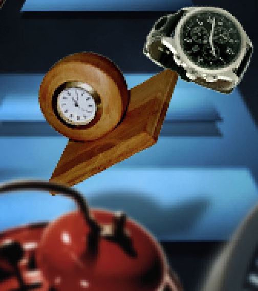
Now we’re going to start playing with the focus of the clocks, just like we did with the blue platforms. I start by applied a 1px gaussian blur to my front red alarm clock and also the tiny clock right in the background.
I’m going to take a slightly different approach with the largest clock, and apply a kind of blur gradient. First of all I duplicate it, and hide the duplicate. I apply a 4px gaussian blur to the original clock, as it’s meant to be out of focus, being very close to us.
Now reveal your hidden duplicate clock layer. Apply a 1.3px gaussian blur to it. Then go to layer>apply layer mask>reveal all. Select a black to transparent gradient tool, and then pull your gradient downwards from the top of this clock. What this does is mask off the top of the duplicate clock, revealing the more blurred original clock beneath it. You’ve effectively created a shift in focus as the clock gets nearer to us.


Now repeat this same technique on the bottom left clock and the metal clock behind the largest clock. As they are not as close don’t use a 4px gaussian blur, but just a 1px one for your original layer, and then don’t blur your duplicate masked layer at all.

Now to start adding shadows cast from the clocks onto the blue platforms. Not all of the clocks will be in a position to cast a shadow, so try to figure out which one’s would. I start with the wooden clock in the center. To cast a shadow I duplicate this clock and move the duplicate layer beneath the original. Then I apply a black color overlay effect. I move the black clock layer down to be over the blue platform beneath, and then use edit>transform>scale to reduce the height of this shape. You want to squash the height to give the impression of a light coming from above the original clock and casting a downwards shadow.
Then I apply a 3px gaussian blur to this layer, and reduce the layer opacity to 50%.
Apply shadows to all of the other clocks that it is applicable to. This should really help tie your overall composition together.

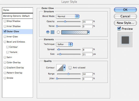
Now apply some text to the top center of your canvas. Apply an outer glow blending option to it (settings below):

Now create a new layer called ‘infinity sign’. Use your path tool to draw out an infinity sign underneath your text. Then with a 1px white paintbrush selected right click on your path line and click ‘stroke path’. This will give you a 1px line forming an infinity symbol. It’s looking a little faint, so I duplicate this layer, and then merge down to leave a single infinity sign layer.
Then I go to my layers palette and right click on my type layer. I click ‘copy layer style’, and then right click on my infinity symbol and click ‘paste layer style’. This will give my symbol the same blue outer glow as my text.

I really hope that you enjoyed this tutorial, and as always would really appreciate your comments.
You can view the full-sized outcome by clicking the image below:

Tom is the founder of PSDFAN. He loves writing tutorials, learning more about design and interacting with the community. On a more interesting note he can also play guitar hero drunk with his teeth.


Do you know the basic tools in Photoshop but feel that your work is still looking average? Join our creative community at FanExtra and get the direction you need to take your work to the next level.


Pretty damn awesome Tom!
I agree with Nikki. Damn nice tutorial You’ve been turning out some really nice posts lately. I enjoy them a lot
awesome
Thanks so much guys, it’s always great to get positive feedback like that .
.
That’s a lot of cropping effort. Great work there. Thanks.
very nice tutorial I like, thanks..
I’m glad you both enjoyed it
damn, so nice tut man keep going! but, you also can use vp to perspective:D
Oh it´s so good, a crazy combination!!
nice tutorial
Thanks guys! I should be posting my next tutorial later tonight.
mame something about vanishing point:) sure if you can:)
and I like name of “time” font. which is it font?
What a great photo retouching job. Please keep posting these quality tuts!
I appreciate your tutorial. I’m a NASCAR photographer and I’ve wanted to put together a collage of rasecars,drivers,fans,etc. I think you clock tutorial will give me the necessary tools. Thanks and I love what you did with the clocks.
impressive